
Below you will be taken through a start-to-finish process of a project based app for a restaurant that desired to create an app to align with their business and future customer needs.
Project Scope: start a new, to-go only establishment offering food and drink to nearby customers.
Processes Covered:
- Target Audience
- Competitor research
- User Research
- User vs Client Needs
- Defining Scope and Goal Requirements
- Content vs Functionality
- Development of Strategy Document
- Sitemap Development
- Wireframe Development
- Navigation Systems
- Visual Mock-ups
- Clickable Prototype
- Closing Comments
Elevator Pitch:
Burrito lovers rejoice! Our new twist on traditional burritos combines the classic flavors you love with innovative ingredients to create a totally unique and delicious experience. With exciting options such as tempeh shrimp, house-pickled vegetables, and luscious sauces, our burritos offer a flavorful journey that's sure to please even the most discerning palate. Give them a try today for an unforgettable meal that everyone can enjoy!
Target Audience / Cost / Location:
- 18-35 years old. College students and working adults. Active, Partier and Studious.
- $12 per burrito
- Redlands, CA
- User Personas were also generated to provide a profile of the target audience as well.
Competitor Research

Understanding the market, visual trends and UI/UX of competitors as well as the target audience the product must deliver to is vital to keep in-mind during these studies.
Two main entities in the area are Chipotle™ as well as a staple business of the area known as El Burrito. The regions they are located are different but lend themselves to similar clientele that fits in the general demographic of what the client desires to land in.
First up is a review of Chipotle's™ website:
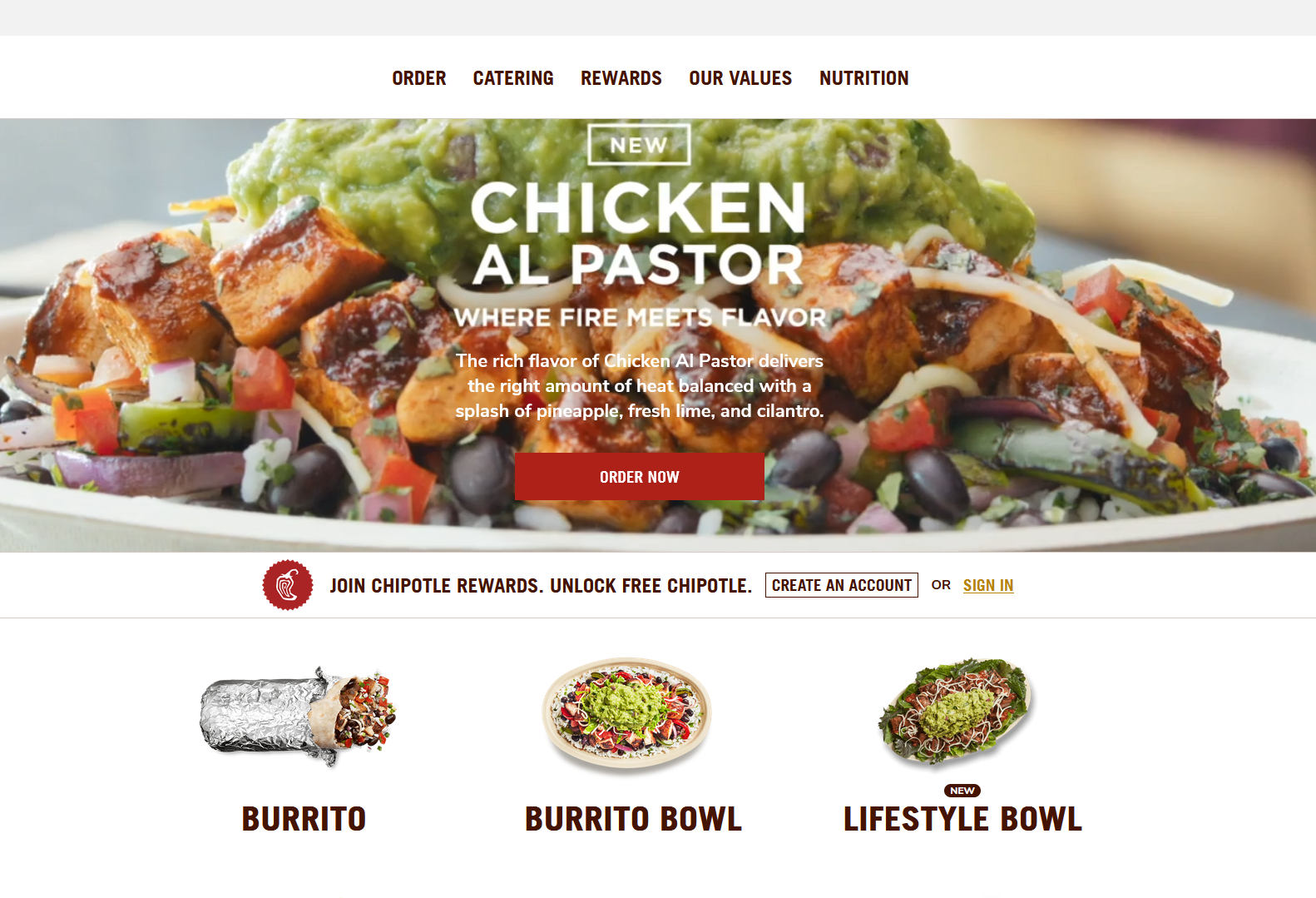
Site Review:
Overall the page is very busy. A large video rolls in the hero section along with a total of 16 visual elements that are vying for users' attention. What works well is the visual isolation of the food options hidden just below as you begin to scroll and leave behind the video visual.
Overall the experience behind the landing page is very simple, clean, direct and intuitive. User interface queues are subtle, responsive and not overly visualized, the combination of which allows for good conversion from entry to purchase with little interest in turning around or deviating from that path.
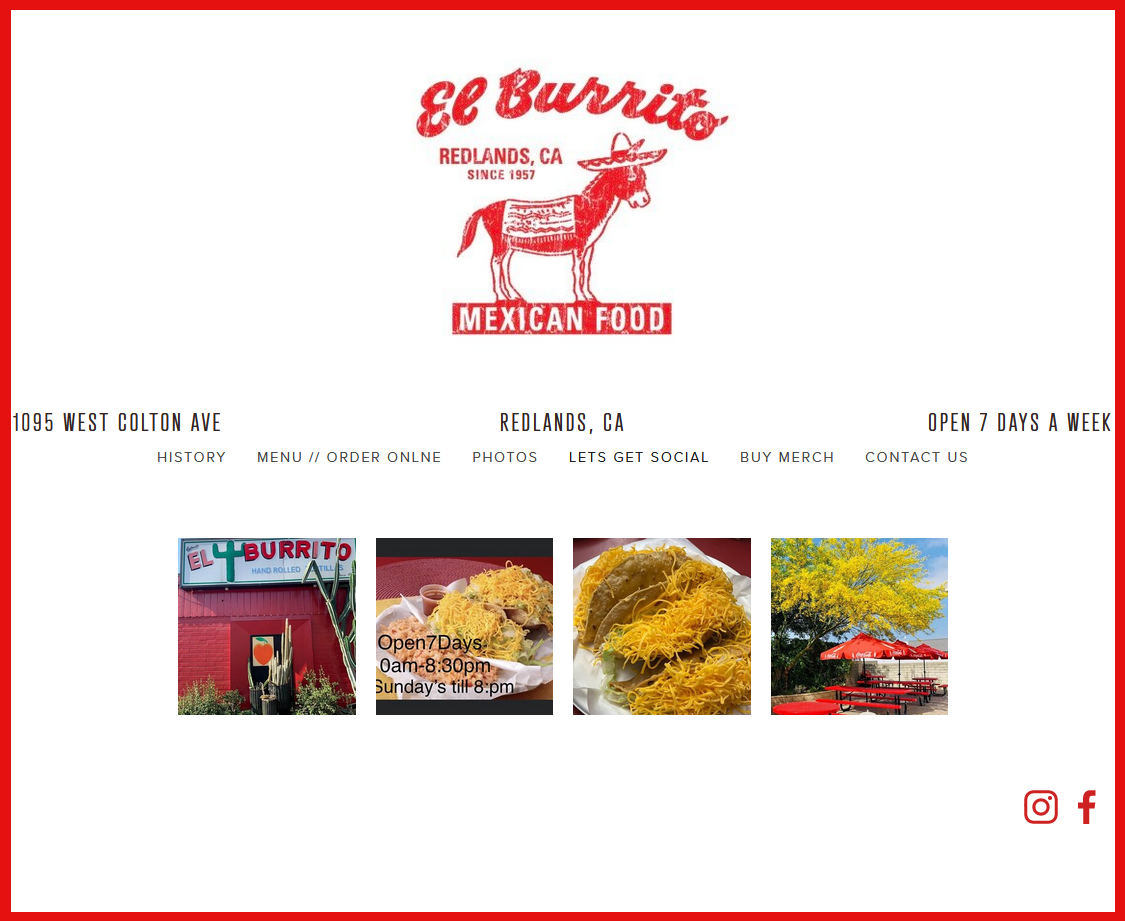
Site Review:
There's a stark difference in the two companies in that one is a large nationwide chain and the other is an individual family-run business. It's a Squarespace™ template build that puts the necessary visual elements at the forefront but steers users to their ordering system. El Burrito incorporates a Doordash™ checkout system which for the most part achieves the same intent of the Chipotle system albeit with some anomalies that visually clash with the UI of the El Burrito site.
Overall there is little continuity in the UI and UX so it's not a very pleasant implementation of a web experience. The connectivity/exchange between the host site and the third party feel very separate. The core of the website is static with no dynamic feel whatsoever. The end result is boring and doesn't request much engagement of the user.
User and Client Needs
It's important to keep the perspective of both the User and the Client in-mind while developing the needs of a project. Both have value in their own ways but when unchecked can lead to cost and schedule deviations. The following are the two need profiles developed:
User Needs:
- Know if the restaurant is open
- Offer in-person pickup via online ordering
- Easily choose from either “previous orders” or start a new order
- Good contrast/visibility for the inebriated
- Apple pay/CashApp integration
- Easy to read and select options
- Estimate the price
- Offer in-person pickup via online ordering
- Easily choose from either “previous orders” or start a new order
- Good contrast/visibility for the inebriated
- Apple pay/CashApp integration
- Easy to read and select options
- Estimate the price
Client Needs:
To sell food online that will be offered for delivery via GrubHub (or similar) and also in-person pick-up
- Provide a system for order customization
- Communicate good order modification page movement (during order)
- Communicate speed in interface
- Communicate status of order (accepted, in-process, complete
- Provide a system for order customization
- Communicate good order modification page movement (during order)
- Communicate speed in interface
- Communicate status of order (accepted, in-process, complete

Reviewing the two lists one can find that there is an overlap/similarity in those needs which is great. A way to combine efforts, reduce cost and schedule of implementation. The resulting Needs list was generated:
1. Clean, Bold UI (simple, good readability, speed in interface)
2. Organized and responsive UX (order navigation forward/backward, Apple Pay/CashApp integration)
3. Communicate price preview and order status
Taking those 3 main needs allows us to proceed with organizing a site map to begin to develop the basic navigation methods within the app/site.
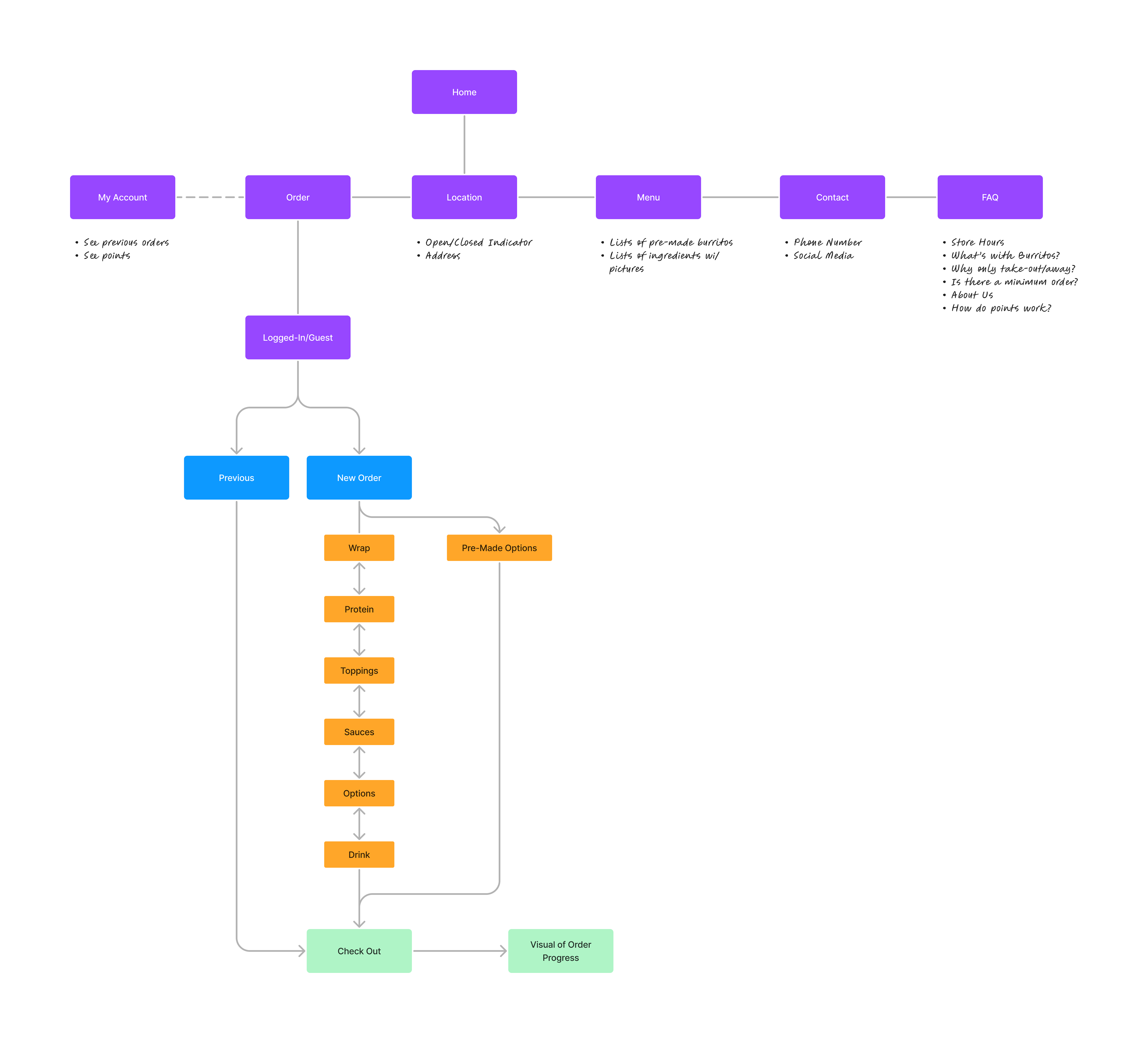
Site Map
The most basic form of how the app/site will operate begins to grow legs here. I thoroughly enjoy working with site maps/user-flows as it ticks at my interest in human thinking and process, the ability to quickly rearrange order and derive the best viable option is a thrill. Through some iterative feedback gleaned from peers that met the target audience (3 people total) the below was finalized as the functional site map:
Wireframes
Once all of the above content is studied, developed, dialogued and agreed to it's a good time to transition into a rudimentary layout that reflects the intent of the requirements, also known as a Wireframe. I've got a host of experience with Adobe Illustrator so that's the tool I chose to use when generating these but many tools are available on the market to use. The output of the Wireframes sought to grasp those top 3 requirements into visual form, along with the workflow as outlined in the site map. The following were the results:
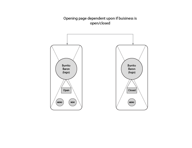
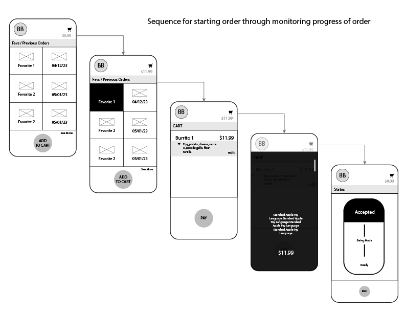
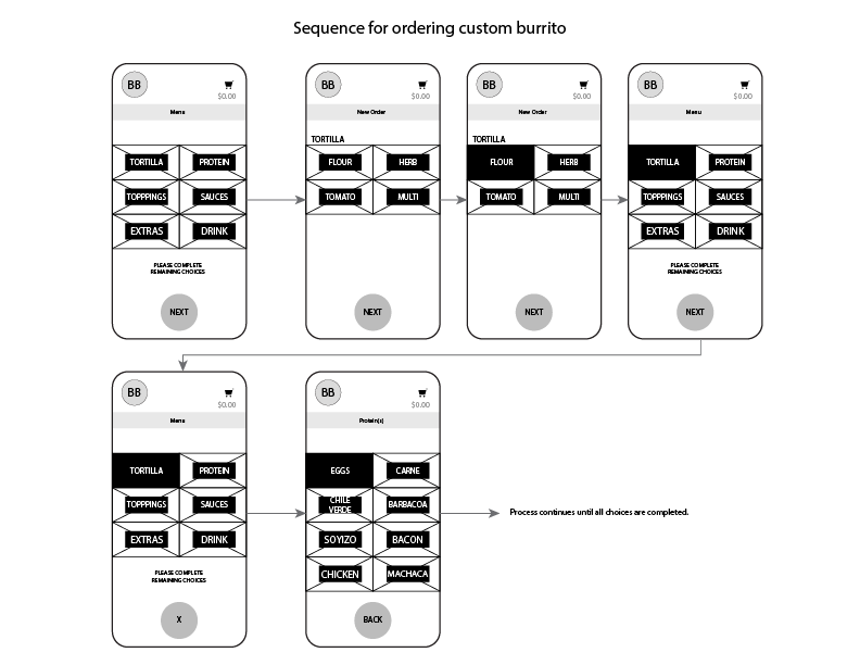
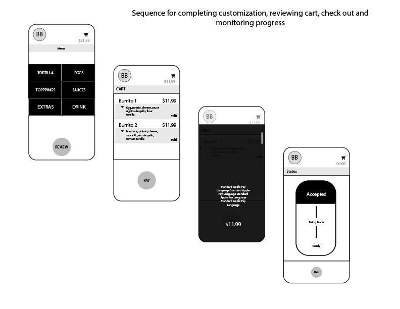
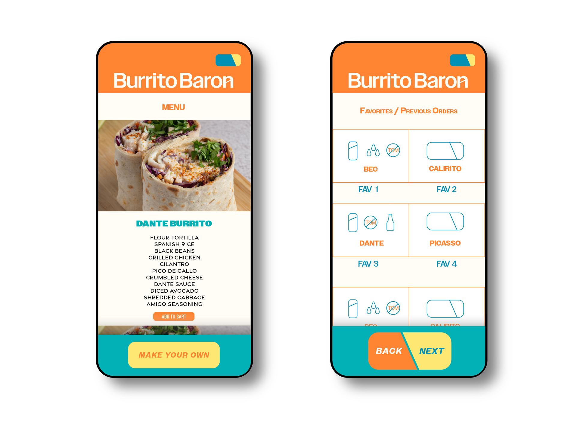
The resulting workflow showcases the functionality requirements of the app/site which focus on clean process visibility and linear workflow in the ordering system. While major UI decisions are handled outside of wireframing it did stand out how the high contrast of wireframing was aiding in influence on later UI decisions as bold/good readability was a user need. The framing of the display leaves users focused on the order process by weighting content within the right-hand user thumb reach arena but can equally work for left handed users as it it mostly a symmetric layout. A previous order/custom order sequence is displayed along with current order cost summary as well as an order status monitoring area after checkout.
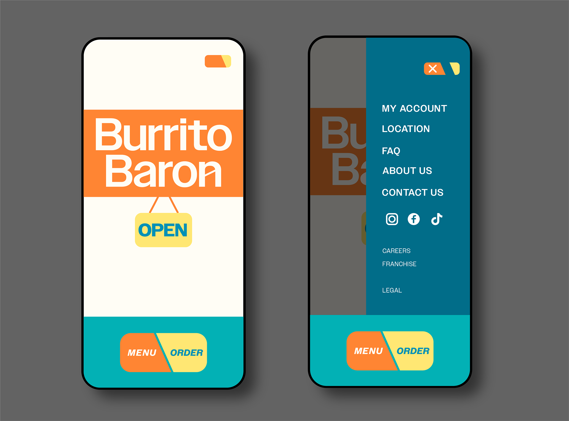
Mock-Ups
Now comes the visual/marketing stage of the project. When we start to breathe life into the app/site using target user data, visual trends and imagine how the wireframe integrates with the potential user interface. Step one is starting with mood board:
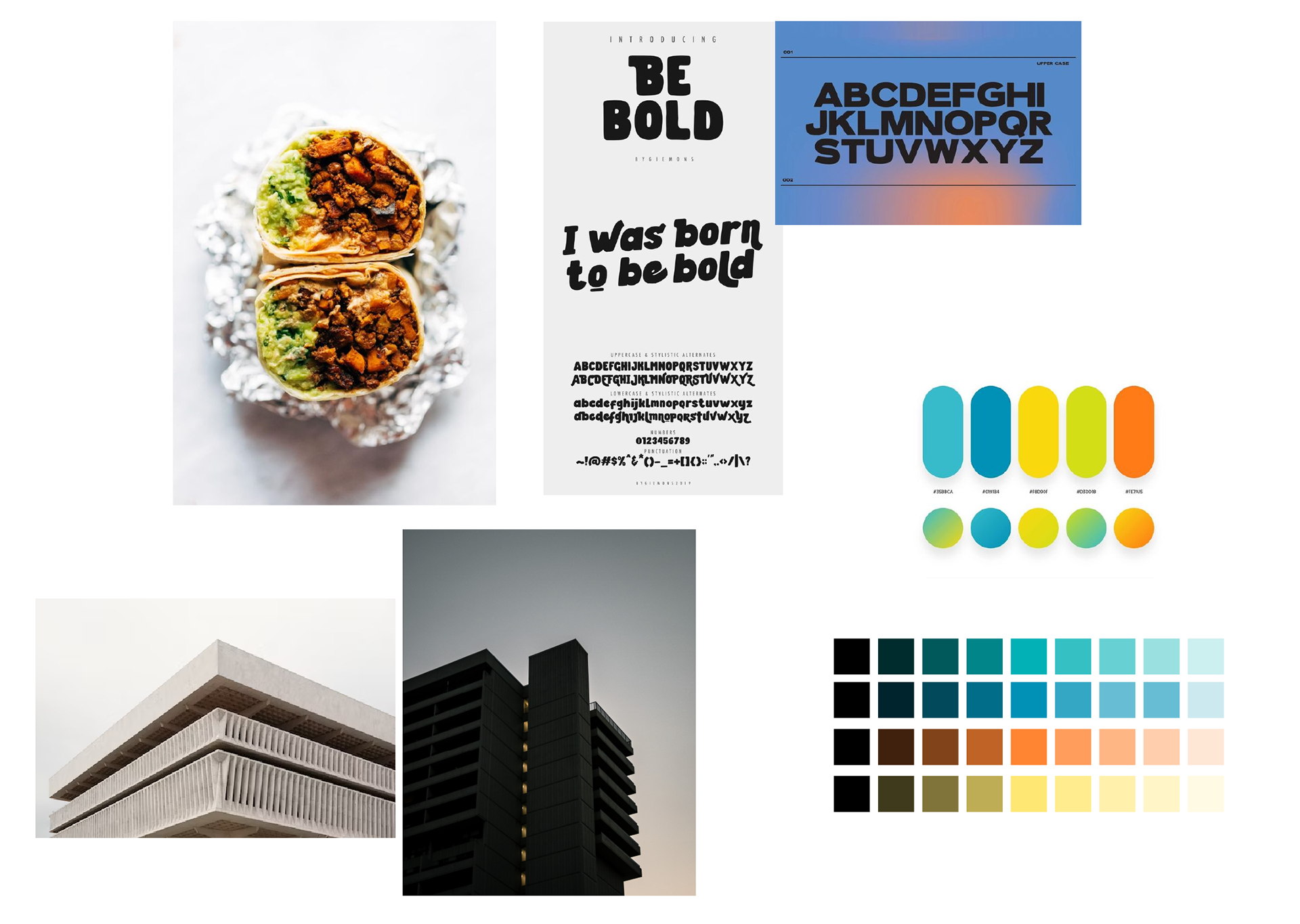
The brutalist aesthetic was giving the right feel of clean contrast. Sans serif fonts would match with the basic terminating edges of the generic shapes found within brutalist shapes. As for colors yellow was the primary color choice to brighten the generic drab/plain aesthetic of basic shapes resembling brutalist design. The remainder of the color palette was chosen to accent around the primary color. With the mood board defined I then turned back to Illustrator to derive the more robust user interface when combined with the methodology behind the wireframe process.
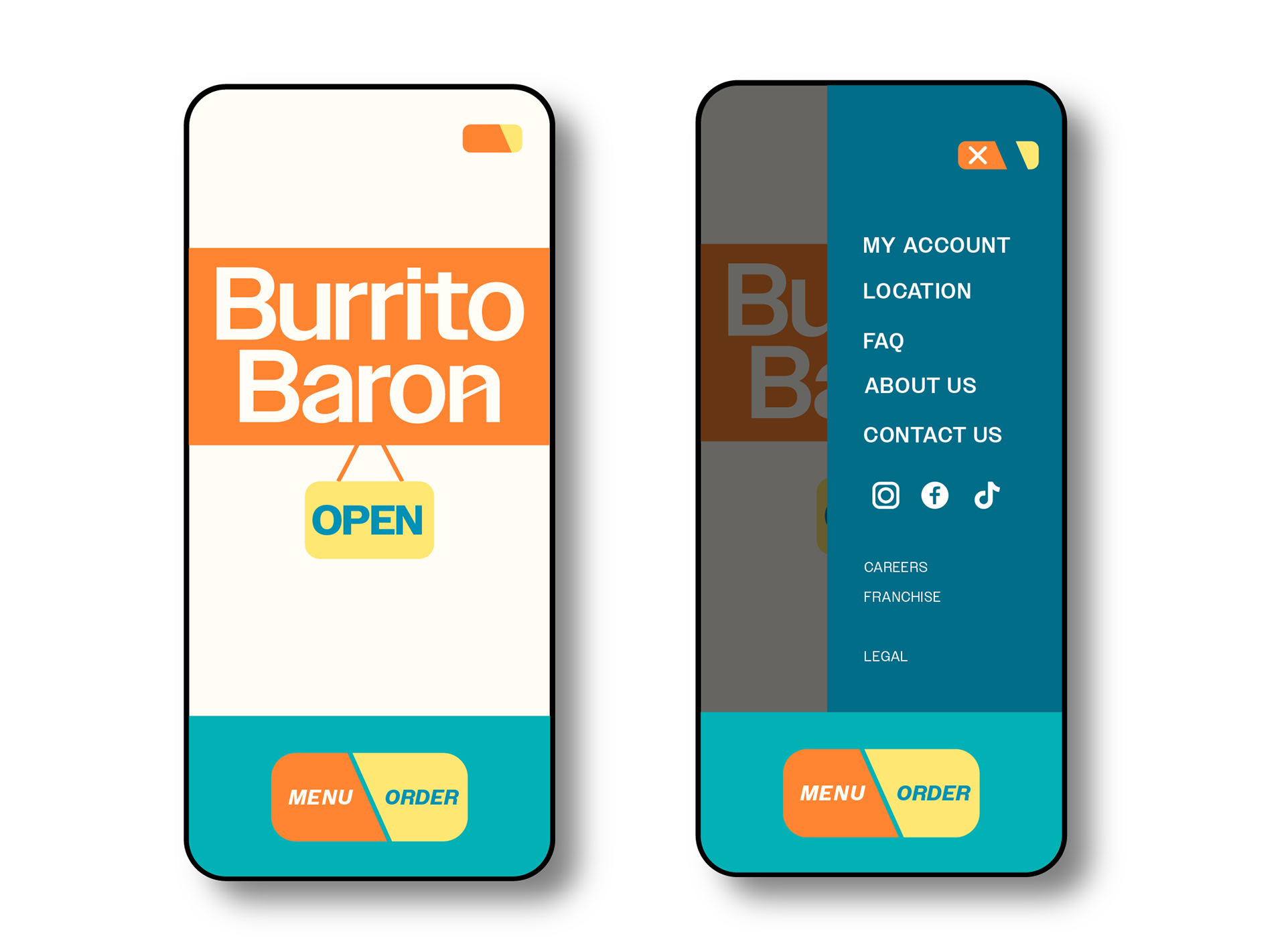

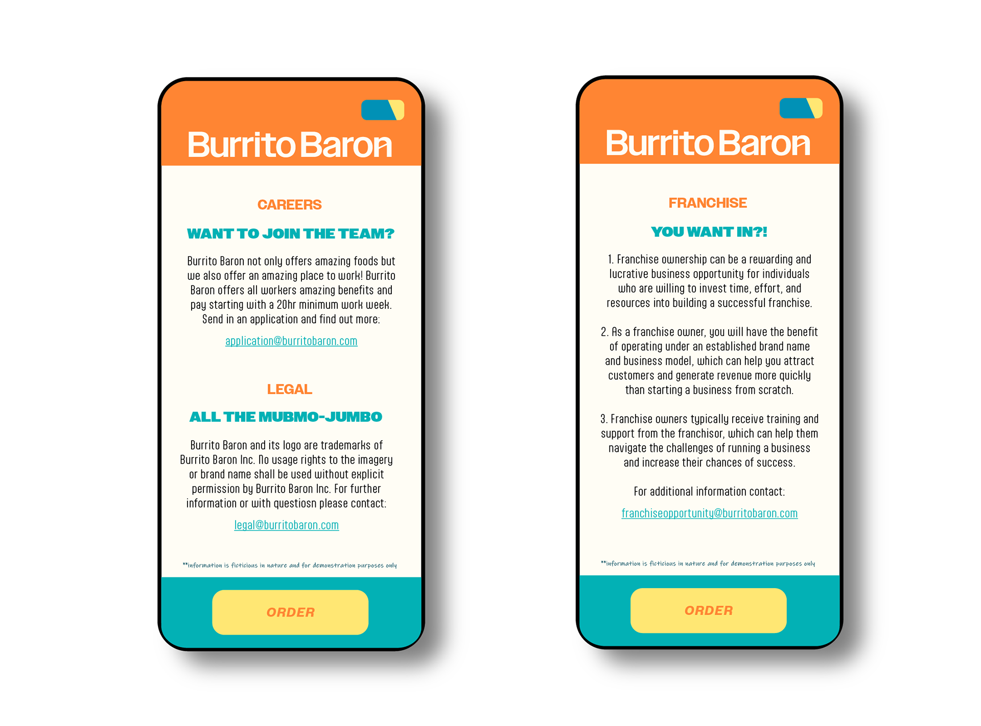
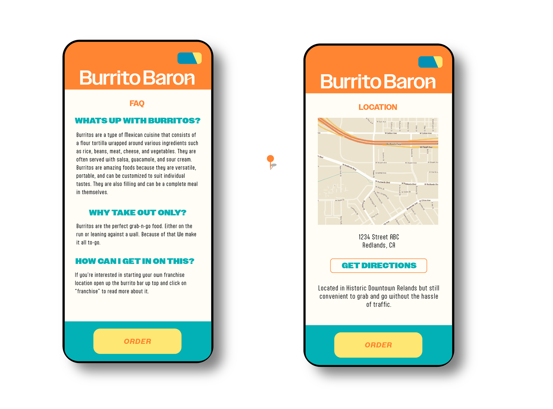
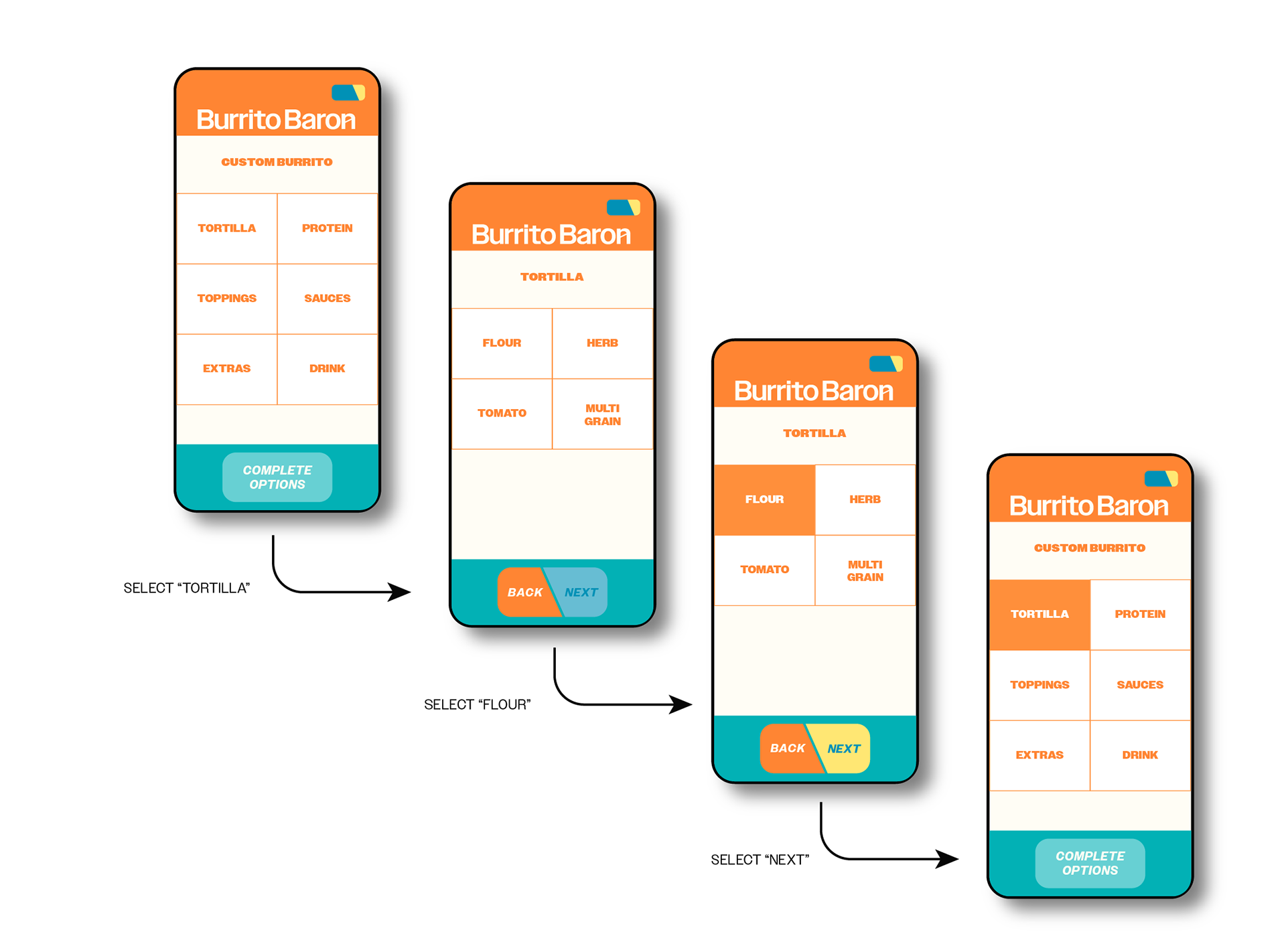
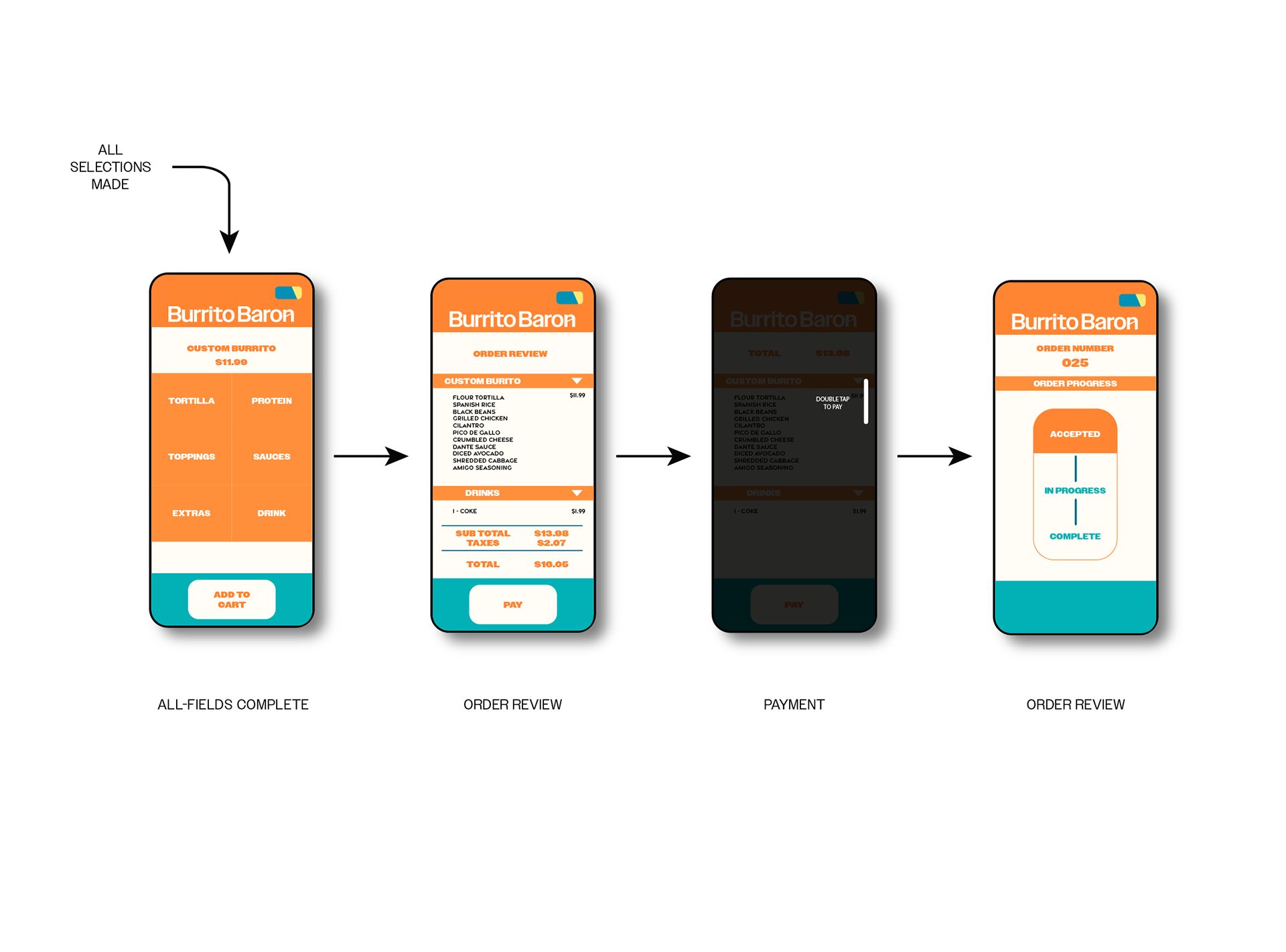
Clickable Prototype
After iteration, dialogue and discussion with users, remapping the visual mock-ups can move into defining a functional prototype to navigate through. Below you will find the mobile app prototype of the above process.
Note: open full screen preview in upper right for best experience.
Note: open full screen preview in upper right for best experience.