One day while chatting with friends one thing became apparent in the talks with everyone; they all spend so much time doing so many things in so many different spaces but it's all related to one topic: Mutual aid. Mutual aid can have many faces, from giving out food or material needs to professional services to open source software or sharing a garden. Here outlines the study and creation of an app named Solidarity that serves to fulfill the needs between those in-need and those that are able to help and network support for those in-need. An app that unifies the simplicity of the basic information needed with a practical and responsive UI/UX layout. Here we go.
What first? Brainstorm with like-minded folks that work in the space and discover what the core needs of the community are. Customer research!
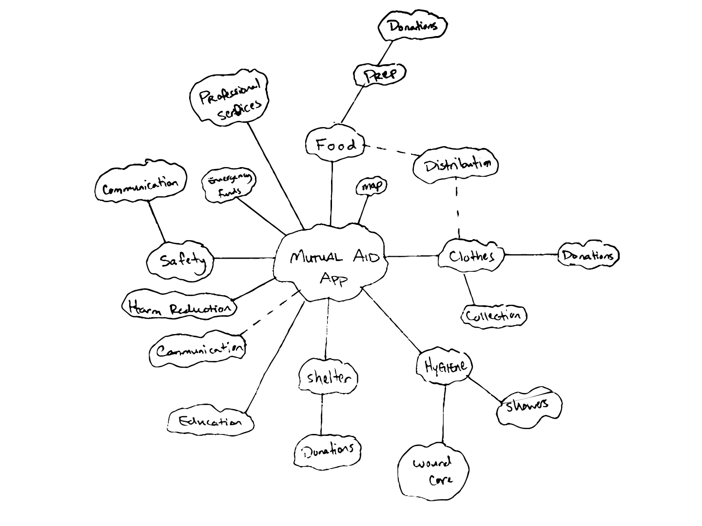
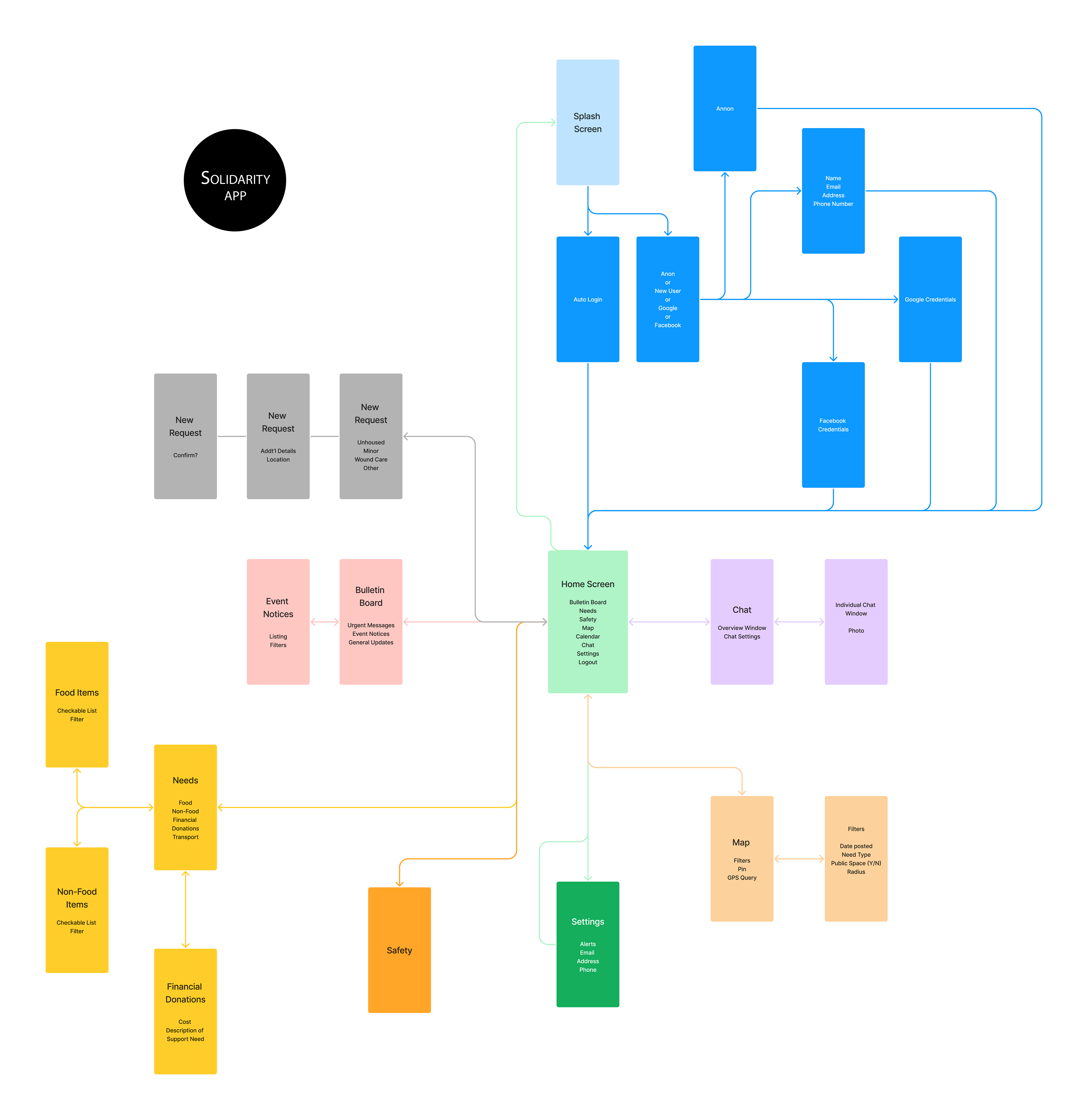
Sitting down and discussing the space multiple need areas were identified. These ideas were then sketched out to get a general content map for what might be included in the app.
Once the general content was laid out it was time to turn to Figma, open a JamFile and begin to clean-up this layout and start giving it some general shape.
The content areas were roughed out and further discussion was had with community members to understand the importance of different need areas. Thinking about user experience became the shifted focus on the discussion, the variety of ways people chose to engage with the platform, the methods in-which they wanted to view content, how to share it within the app, how to identify priorities, all of it was expanded upon and that began to mature the starting point of the above site map into a more mature model as shown below.
Next came the sticky notes! Lot and lots of sticky notes! Each element of the site map was drawn out in a basic form and stacked up. I scheduled some time with 5 different members of the community project to engage with them and determine their thoughts on how they would perceive the content and what they felt compelled to do with it. Those individuals are outlined below:
- Susan; 36, Female, Mom, Active, College Degree, Caring, Activist
- Jaden; 14, Non-binary, highschooler, into anime, artist
- Chris; 34; Male, Chemist, loves cats, jovial, active
- George; 28; Male, Geologist, loves colognes; hiking; wearing denim
- Taryn; 38; Female; Mom, Etsy shop owner, activist
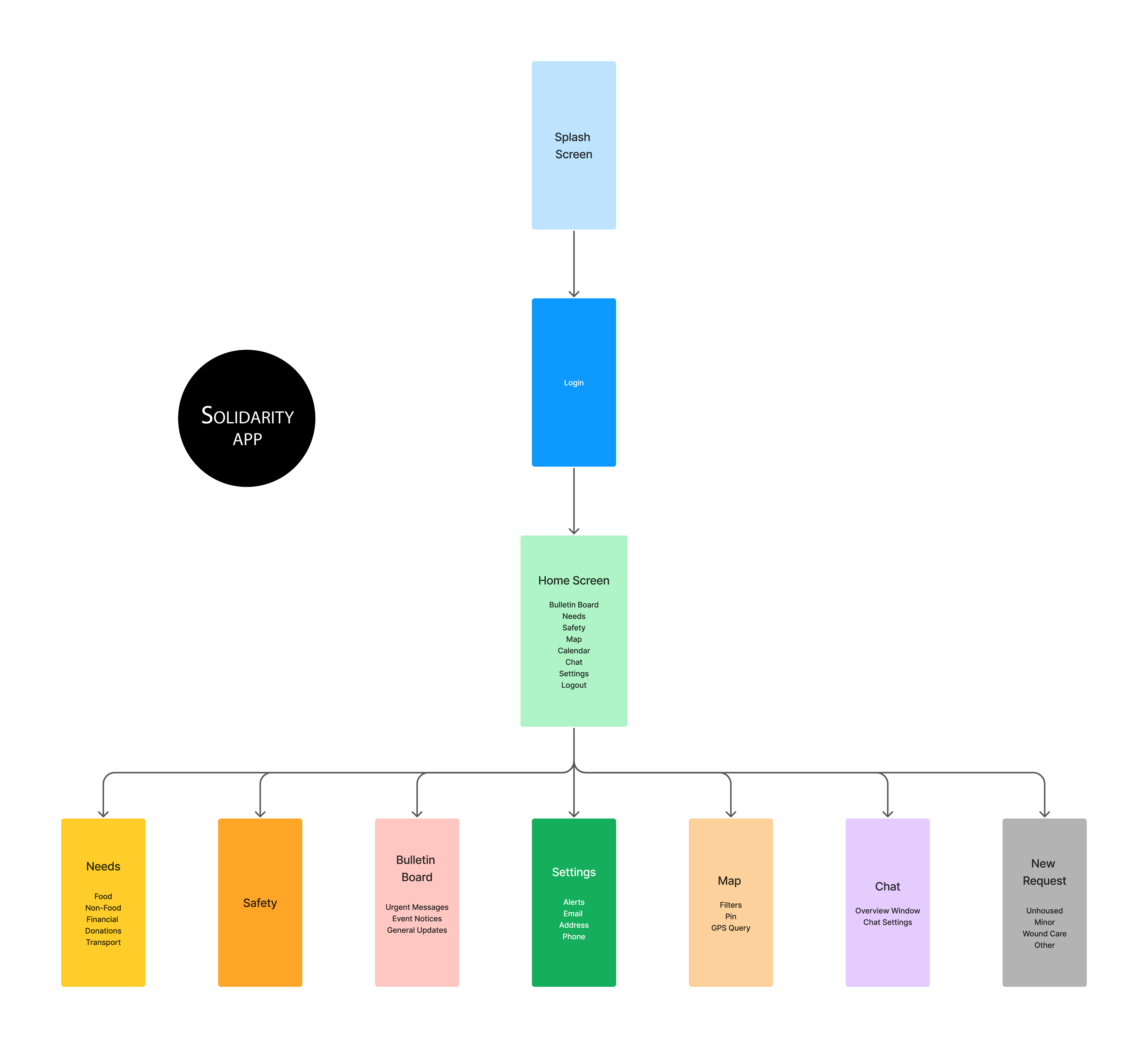
During the user-feedback sessions we passed through the workflow to discover what questions each user had and if it was clear what action they were drawn to take action to. The first round demanded some adjustments to the 'topic' descriptions to better suite what a natural curiosity for their search/navigation areas were. Most of the base layout as initially described worked for them and didn't require significant adjustment. Overall the user-feedback at this level made adjustments to the categories and flow as they researched each topic. I went back to my JamFile and began rearranging the flow and descriptors to align with the requests of the users. Once the big shifts were made then came the wireframe build in Figma.
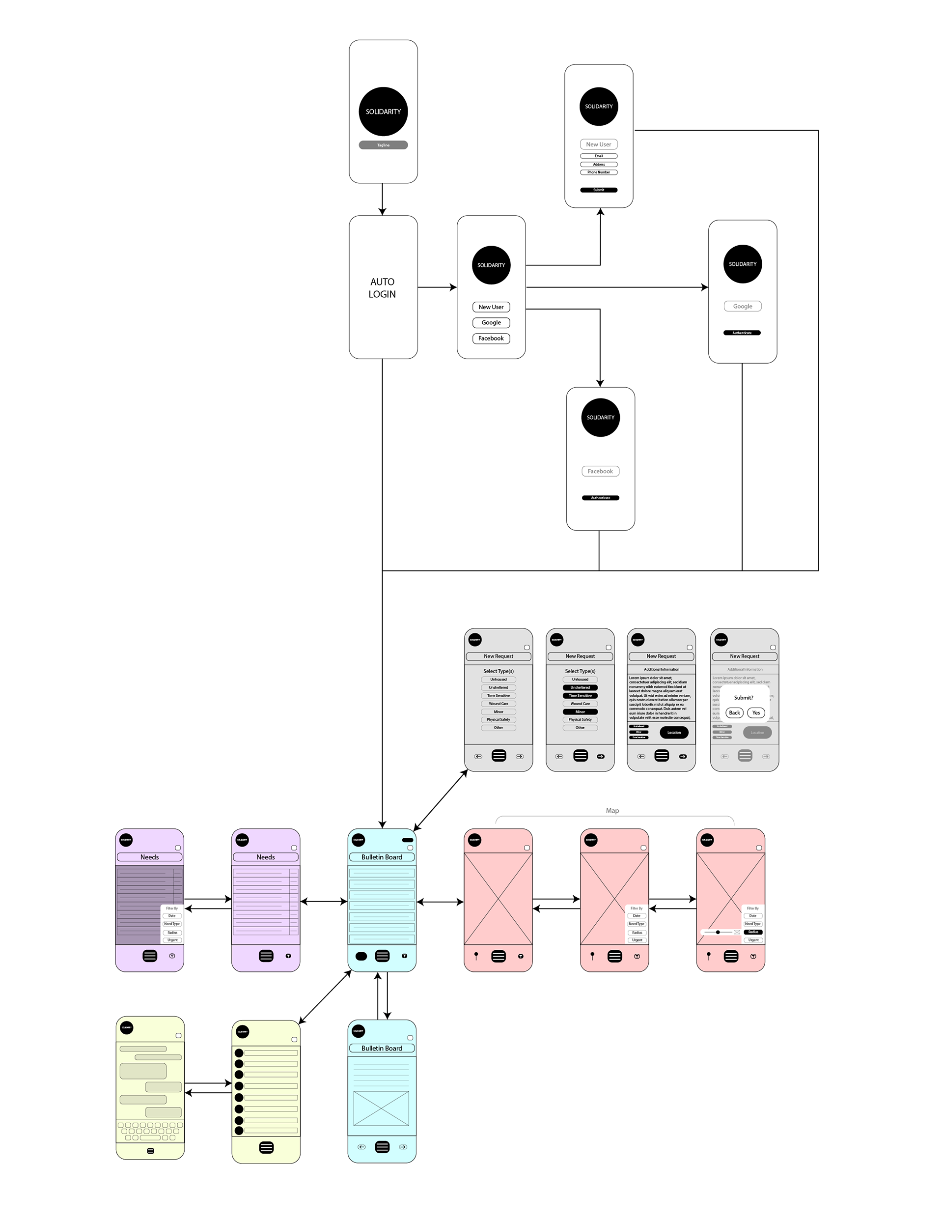
After constructing the wireframe of the user experience I turned to Figma to begin the build of the app. In this case I choose not to build any unique design systems to root this experience in (time) knowing that this is only going to live as a prototype experience. The overall UI look was gauged and applied to the componentry and framework of the components/build. The build followed the bones of the wireframe and matured into a series of components and pages while maturing a bit of the UI along the way. Once it was matured enough through internal review and iteration for flow and response it was then offered to 3 different users to preview the prototype. This experience offered some changes to transitions between pages (speed and direction of push-ins) as well as adjustments to overlay dimming.
Resulting App Prototype below, Tap screen to begin.
(Note: prototype only runs in desktop browser, tap full screen in upper right for best experience, not all features are active)
Reflections:
This case study offered a glimpse into helping solve the problem of mutual aid communications and information organization. If this app stands to mature the core components warrants an atomic build to retain brand consistency and UI/UX streamlining.